
Running, Satin, or Fill: Matching Embroidery Stitch Types to Logo Shapes
The right stitch for a logo depends on its shape, size, and role in the design: running stitches handle fine lines and outlines, satin stitches suit narrow columns and lettering, and fill stitches cover broader areas. Choosing among embroidery stitch types for logos also means accounting for fabric and stitch direction. A skilled embroidery digitizing service turns those choices into a file designed to sew cleanly.
Quick guide: match the stitch to the shape
- Running stitch: Thin lines, outlines, small details, and elements that should remain visually light.
- Satin stitch: Narrow borders, lettering, and compact shapes that can be covered with stitches laid across the column.
- Fill stitch: Wider shapes and larger solid areas that need stitched coverage across a broader surface.
These are practical starting points, not automatic rules. A shape’s dimensions, surrounding details, garment material, and intended appearance can all affect the final stitch plan. Digitizing is the process of translating the artwork into stitch instructions, so the best result comes from selecting stitches for how the logo will actually sew—not simply tracing every graphic element.
Running stitch: for lines that need definition, not coverage
A running stitch forms a line of individual stitches. It works well for outlines, fine interior details, and narrow paths that would become bulky or lose their shape if treated as a broad column. It can also provide subtle detail in a logo where a heavier stitch would compete with the main lettering or symbol.
Running stitches are not usually the right choice when a logo element must look like a solid, covered shape. A thin line may be appropriate for an outline, but using it to represent a wide area can leave the fabric visible and make the design look incomplete. The digitizer has to distinguish between an element that is meant to be a line and one that needs visual weight.
Short, tightly packed paths and abrupt changes in direction can also affect how a line sews. In small details, stitch placement and path planning matter: poorly arranged segments may create unnecessary buildup or an uneven appearance. A production-ready file uses running stitches where they support the artwork and avoids using them as a shortcut for shapes that need more coverage.
Satin stitch: for columns, borders, and readable lettering
Satin stitches form a smooth, connected column, with stitches crossing from one edge of the shape to the other. This makes satin a natural fit for many logo letters, narrow bands, and borders. When the column width is appropriate, the surface can look clean and defined, helping text and compact forms stand out.
Shape width is an important consideration. Very wide areas may be difficult to represent well as one satin column, while very narrow details may not hold their shape at the intended finished size. Instead of forcing every element into satin, a digitizer may need to divide a shape, change stitch type, or simplify details that are too small to reproduce reliably.
Lettering deserves particular attention because counters, tight curves, and close spacing can disappear or fill in when stitched. The digitizer needs to plan stitch direction and sequencing around the letterforms, and account for the way thread and fabric affect the finished edges. A logo that looks crisp on screen may need practical adjustments to remain legible when embroidered.
Fill stitch: for broader shapes and solid coverage
Fill stitches cover larger regions with rows of stitches. A tatami fill is commonly used for broad logo areas because its rows can cover a shape without treating the entire surface as a single satin column. The angle and direction of those rows influence the visual texture and how the fill interacts with the outline and neighboring elements.
Coverage is not simply a matter of adding more stitches. Excessive density can create stiffness, thread buildup, or distortion, while insufficient coverage may allow too much fabric to show through. The right tatami fill stitch density depends on the design and its production context, including the fabric and the size of the embroidered area.
Stitch direction also affects how a filled shape reads. Changing the angle can help distinguish adjacent sections, follow the form of an element, or make a large area look less flat. Underlay and pull compensation are other digitizing considerations: they help account for fabric movement and the way stitches can pull a shape inward as it sews. These settings should support the specific design rather than be applied identically to every logo.
When a logo combines all three stitch types
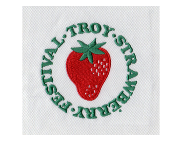
Many logos are not a one-stitch decision. A badge might use fill for a broad background, satin for text and a narrow border, and running stitches for fine interior lines. Combining stitch types can create a clearer visual hierarchy while keeping each part appropriate to its shape.
The order of elements matters, too. Digitizing determines how sections connect and sew, which can affect overlaps, edges, and thread buildup. If a small outline is stitched in a way that competes with a nearby fill, the finished design may look heavier than the artwork suggests. A considered stitch plan balances appearance with a sequence that can run smoothly in production.
What to consider before digitizing a logo
- Finished size: Details that are distinct in a large graphic may merge when embroidered small.
- Shape width: Narrow columns often suit satin; broad forms usually need a fill strategy.
- Fabric: Material and stability influence coverage, density, and how the design behaves as it sews.
- Visual priority: Use stitch weight and direction to keep the main lettering or symbol easy to read.
- Production use: A logo intended for a garment or other embroidered item needs a file planned for its actual application.
These considerations are why artwork alone is not enough to determine stitch count or final results. The digitizer interprets the logo, chooses stitch types, and makes technical adjustments for the intended embroidery. A general embroidery thread density guide can help explain density concepts, but the correct settings still depend on the specific design and production conditions.
How professional digitizing supports production
An embroidery machine follows stitch instructions; it does not automatically understand which parts of a logo should be outlines, columns, or fills. Professional digitizing converts the visual artwork into a file with planned stitch types, directions, sequencing, and other settings needed for embroidery. That preparation helps prevent common problems such as crowded details, uneven coverage, distorted edges, or lettering that becomes hard to read.
When evaluating a digitized design, consider more than whether the file opens. The file should reflect the requested artwork and be planned for its intended use. If a sew-out is available, reviewing the stitched result can reveal how the fabric and thread affect details that are difficult to judge from a screen preview. Any needed adjustments can then focus on the actual outcome rather than guesswork.
Eagle Digitizing provides embroidery digitizing services for customers who need artwork converted into embroidery files. Share the design and relevant production details when requesting a quote so the digitizing needs can be understood in context. To discuss a project, request an embroidery file quote.
Choose stitches by structure, then refine for the sew-out
Running stitches are best for purposeful lines and fine details, satin stitches define compact columns and many logo letters, and fill stitches cover broader shapes. The right combination depends on the artwork’s dimensions, the fabric, and the finished appearance you need. If you’re ready to prepare a logo for production, Eagle Digitizing can help with an embroidery digitizing service and the stitch planning behind clear, production-ready embroidery.