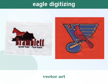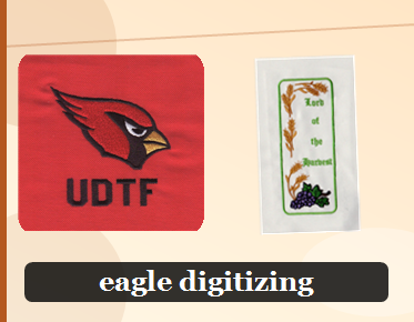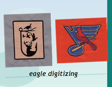

Complex Multi-Color Logo Before & After
A complex logo may look crisp on screen but sew poorly when its colors, small details, and stitch sequence have not been planned for embroidery. A professional logo digitizing service converts artwork into stitch instructions designed for the intended fabric and application. This before-and-after guide explains what changes during multicolor logo digitizing and what to look for in a cleaner, more production-ready result.
What “before and after” should reveal
A useful before-and-after comparison is not simply a brighter thread palette or a denser sew-out. It shows how artwork has been interpreted for stitches: which details remain, how color areas connect, where the machine changes threads, and whether the finished embroidery holds its shape on the product.
The “before” may be a raster image, a vector logo, or an existing stitch file that needs revision. Each presents different challenges. Artwork can contain smooth gradients, narrow outlines, tiny lettering, or overlapping colors that look effortless on screen but need decisions before they can be stitched. The “after” should be an embroidery design with a deliberate stitch plan—not just a visual copy of the source file.
That distinction matters for company apparel, hats, jackets, and other branded products. A logo that loses small text or leaves gaps between color sections can undermine the appearance of the whole item. Good digitizing focuses on how the design will sew, not only how it looks in a preview.
Before: common problems in complex logos
Multi-color artwork often combines elements that behave differently under a needle. Large filled shapes need appropriate coverage; narrow borders need enough width to remain visible; lettering needs to stay readable; and overlaps must be planned so the fabric does not show through where colors meet.
When those details are not considered, a sew-out may show problems such as:
- Uneven fills: Stitching can look crowded in some areas and sparse in others if density is not suited to the shapes and material.
- Gaps at color boundaries: Fabric can shift or pull during sewing, making adjacent sections appear separated.
- Distorted outlines: Pull from stitching can change the shape of narrow borders or small lettering.
- Unclear fine details: Tiny text, thin lines, or small counters in letters may close up or become difficult to read.
- Unnecessary thread changes: A poorly planned sequence can create avoidable stops and affect the flow of production.
These issues are not always visible in the original artwork. They emerge when the design is converted into stitches and sewn on a real garment or other substrate. That is why simply matching the visible colors is not enough.
After: what professional digitizing changes
A digitizer builds the logo from stitch objects and assigns each object a purpose, direction, and sequence. Satin stitches may suit narrow columns or lettering, while fill stitches can cover larger shapes. The choice depends on the design, its dimensions, the fabric, and the intended embroidery application.
Stitch direction can help define the appearance of a shape and influence how the design lies on the material. Underlay supports the top stitching, while pull compensation accounts for the way embroidery can draw fabric inward. Density also needs to be considered: adding more stitches is not automatically a fix, since excess stitching can make a design stiff or bulky.
Color sequencing is another part of the transformation. The order in which sections sew can affect overlaps, transitions, trims, and the overall efficiency of the design. The goal is not to preserve every visual effect in the artwork at any cost. It is to create a clear, sewable version that keeps the logo recognizable while respecting the limits of thread and fabric.
Compare the sew-out, not just the preview
A screen preview can help review shapes and color order, but it cannot fully show how stitches interact with a particular material. For a meaningful before-and-after review, compare the embroidered result with the original logo and check:
- Are the main shapes and proportions still recognizable?
- Do adjacent colors meet cleanly, without distracting gaps or excessive overlap?
- Is small lettering legible at the actual embroidery size?
- Do borders and narrow details hold their intended shape?
- Does the design sit appropriately on the selected fabric?
- Are the color changes and stitch sequence practical for production?
If the sew-out reveals a problem, the right adjustment depends on its cause. A gap may call for revised overlap or pull compensation, while cramped lettering may need a size or detail adjustment. Increasing density across the entire logo without diagnosing the issue can create new problems instead of solving the original one.
Color choices and stitch properties work together
Thread color is important to brand recognition, but color alone does not determine the quality of a multi-color sew-out. Adjacent shades need enough contrast to remain distinct, and the order of stitched areas can influence how transitions appear. When selecting thread, consult reliable embroidery thread color options and consider the intended garment and viewing conditions. A digital color displayed on a monitor may not look identical to thread on fabric.
Stitch settings also affect the finished appearance. Reviewing relevant embroidery stitch properties can help clarify how stitch attributes contribute to a design. In practice, those properties must be considered together: a change to density, underlay, or direction can influence coverage, flexibility, and the way neighboring sections meet.
There is no single setting that works for every logo. A design intended for a stable, flat fabric may need a different approach from one going on a cap or a stretchy garment. Share the intended application when requesting digitizing so the stitch plan can be developed with the production context in mind.
Small lettering and high-detail artwork
Text is often where a complex logo is most vulnerable. Letterforms that look clear in a large source image may become crowded after reduction. Fine strokes can lose definition, and enclosed spaces within letters can close as stitches spread into the fabric. A professional digitizer evaluates lettering at the size it will actually be embroidered rather than assuming that every printed detail will translate unchanged.
When a detail cannot be reproduced reliably at the requested size, the design may need a considered adjustment. That could mean simplifying a small element, improving spacing, or discussing a practical size with the customer. The aim is to preserve the logo’s identity while producing embroidery that remains readable and balanced.
What to provide for a better result
Clear project details help a digitizer make informed decisions. When you submit a logo for professional conversion, include the best artwork available and note the intended embroidery size, product type, fabric, and any brand colors or design elements that must remain distinct. If the logo has small text or fine outlines, identify those priorities rather than assuming they will be obvious at every finished size.
It is also useful to explain how the design will be used. A left-chest logo, cap front, and large jacket-back design have different space and placement considerations. The same artwork may need a different stitch approach for different applications. A capable embroidery digitizing company can use those details to prepare a design for the intended embroidery work rather than treating the source image as a one-size-fits-all template.
From artwork to production-ready embroidery
Eagle Digitizing provides embroidery digitizing services for customers who need artwork converted into stitch files for production. For a complex multi-color logo, the work involves more than tracing outlines: it requires planning stitch types, direction, density, underlay, compensation, and color order in relation to the design and its use.
When requesting a quote, share the artwork and explain the product or fabric, target size, and any details that must remain legible. If you already have a stitch file that is not sewing as expected, describe what you see in the sew-out so the issue can be assessed. Submit your design to Eagle Digitizing to discuss the digitizing needed for your project.
A strong before-and-after result makes a complex logo clearer, more balanced, and better suited to embroidery—not merely different in appearance. With thoughtful multicolor logo digitizing and a stitch plan matched to the application, Eagle Digitizing can help turn detailed artwork into a more production-ready embroidery design. Request a quote and share your logo, intended size, and fabric to get started.