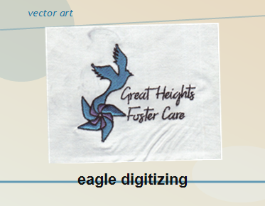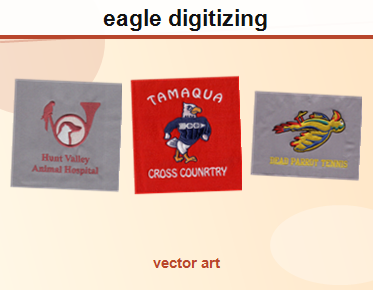

Before & After: Multi-Color Apparel Logo Prepared for DTF Production
A useful DTF logo before and after comparison shows more than a sharper-looking image: it reveals how artwork was reconstructed into clean, editable shapes that are easier to review and prepare for printing. Because no specific logo file or project image is provided here, this guide explains the changes to look for in a multi-color apparel logo without presenting an invented customer transformation.
What a meaningful before-and-after should show
For DTF apparel printing, the starting point is often a logo saved as a small JPG or PNG, or artwork that has been repeatedly resized. A preview may look acceptable on a screen while its edges, small details, or color boundaries become difficult to work with during production. A useful comparison makes those underlying issues visible instead of relying on a vague claim that the design is “cleaner.”
The “before” side should represent the supplied artwork as it actually exists. Depending on the file, that may mean showing pixelated edges, uneven outlines, small gaps, or color regions that are difficult to distinguish. The “after” side should show the reconstructed vector artwork at the same scale, with clear contours and intentional boundaries between shapes. These are common evaluation points—not claims about any particular supplied logo.
Vector artwork can be scaled without the same pixelation associated with enlarging a raster image. It also gives a designer or production team editable paths and shapes to inspect. That is valuable for apparel graphics, but vector conversion alone does not determine printer settings, film handling, ink limits, or the final appearance on every garment. Those details depend on the printer, RIP software, materials, and production workflow.
Before: issues to identify in the source logo
Before changing artwork, review what is actually present in the file. A low-resolution image should not be treated as though every edge and color transition is precise source information. The conversion process may require reconstructing shapes rather than automatically tracing every pixel.
- Soft or jagged contours: Enlarged raster artwork can show stair-stepped edges or blur, especially around curves and diagonal lines.
- Unclear color boundaries: Adjacent colors may blend in the image preview, making it uncertain where one printed shape should end and another should begin.
- Very small details: Fine gaps, narrow outlines, or tiny lettering may be hard to reproduce consistently at the intended print size.
- Unnecessary background pixels: A file may appear to have a transparent background but contain a filled background or stray pixels. The actual file should be checked rather than assumed.
- Unreliable color information: A screen preview is not a guarantee of how colors will look after printing. The source file, color settings, RIP, inks, and garment can all affect the result.
These observations help distinguish a file-format problem from a design problem. For example, converting a blurry logo into a vector container does not automatically restore details that are missing from the source. Those shapes may need to be redrawn, simplified, or confirmed with the artwork owner.
Vector conversion: rebuild for clarity, not just file format
A strong conversion focuses on the logo’s structure. The goal is to create intentional, clean vector paths that follow the artwork’s real shapes. For a multi-color mark, that also means checking how each color region meets neighboring regions and whether outlines, counters, and overlaps are represented consistently.
Automatic tracing can be useful for some simple artwork, but a trace of a low-resolution image may reproduce its defects as excessive anchor points, uneven edges, or fragmented shapes. A careful vector redraw instead interprets the design and reconstructs the geometry. The right approach depends on the original file and how much detail it contains.
- Inspect the source at a useful zoom level before tracing or redrawing.
- Rebuild curves and corners as smooth, intentional paths.
- Keep separate color regions organized and easy to review.
- Check small text and fine details at the expected print size.
- Preserve the design’s proportions and recognizable features.
- Confirm uncertain details instead of guessing what the original artwork intended.
For a multicolor mark, the result should be more than a collection of outlines. Shapes need to make visual sense together, especially where colors touch or overlap. A well-organized multi color apparel vector gives the production team artwork that is easier to inspect and adjust before the print workflow begins.
After: review the artwork before production
Once the paths have been reconstructed, compare the vector with the source at the same size. Look for details that were lost, altered, or unintentionally introduced. Then inspect the artwork at a larger zoom to catch rough joins and stray points. A clean-looking thumbnail can conceal path problems that only become obvious when the file is enlarged.
Review color areas independently as well as in the full logo. The purpose is not to impose a particular number of colors or a universal color recipe; neither can be determined without the supplied design and production requirements. Instead, confirm that the intended regions are distinct and that the artwork’s organization is clear to whoever will prepare it for the printer.
File setup matters at handoff. A vector format can keep shapes editable, but the correct export and document setup depend on the receiving workflow. For print and cut jobs, follow the production provider’s requirements for dimensions, color handling, and file structure; a general print cut artwork setup reference can help explain why preparation details should be confirmed before output. DTF printing may use a different workflow, so do not assume that print-and-cut instructions automatically apply.
Color and file checks before sending artwork
Color appearance can change between an on-screen preview and a printed result. Before handing off a file, check the intended color mode and document settings against the print provider’s instructions. Adobe’s guidance on print color preparation provides background on document setup, but the printer or production team should determine the settings for a specific job.
Also ask how the artwork will be processed downstream. A vector file can preserve scalable geometry, while the RIP may rasterize the art as part of the printing process. The vector source does not replace the need for the correct print profile, resolution, transparency handling, or other production-specific settings.
Practical before-and-after checklist
- Compare like with like. View the supplied artwork and converted version at the same size so improvements are easy to assess.
- Check edge quality. Inspect curves, corners, outlines, and joins for jaggedness, gaps, or stray points.
- Review every color boundary. Confirm that neighboring shapes are deliberate and that the artwork’s color organization is understandable.
- Test the smallest elements. Check fine lines and small lettering at the intended garment print size; discuss anything that may be too delicate.
- Verify the handoff format. Confirm the accepted file type and any setup requirements with the production provider.
- Keep the original. Retain the supplied raster file and an editable vector master so the artwork can be reviewed or revised later.
Depending on the requested handoff, vector artwork may be saved in formats such as AI, EPS, PDF, or SVG. Do not assume that every format is accepted by every print provider. Confirm the preferred file type and any required export settings before production.
Frequently asked questions
Does converting a logo to vector automatically make it DTF-ready?
No. Vector conversion can improve editability and preserve clean shapes when artwork is scaled, but it does not set the printer, RIP, color profile, or job-specific output settings. Ask the production provider what the final file must include.
Can a low-resolution PNG be converted without changing the design?
Often, its visible shapes can be reconstructed, but a small raster image may not contain enough detail to recover every original feature precisely. A designer may need a clearer reference or approval for simplified details. Conversion should not be presented as a guaranteed restoration of information that is absent from the source.
Should a DTF logo be separated into individual colors?
Color regions should be clear and organized, but the required file structure depends on the production workflow. Some workflows handle artwork and separations in the RIP. Confirm the printer’s requirements before preparing separate plates or changing the artwork structure. Adobe’s explanation of a vector color workflow offers general context on color separations, not a substitute for DTF-specific instructions.
Prepare the logo for its next step
A helpful before-and-after review makes the artwork’s geometry, color boundaries, and remaining production questions easy to see. It should distinguish verified improvements from decisions that still require printer specifications or owner approval. If your apparel logo needs a vector redraw or cleanup before DTF production, contact Eagle Digitizing to discuss the artwork and request a quote. A carefully prepared DTF logo before and after starts with the file you have and a clear plan for the file your production team needs.