
How to Simplify embroidered patch artwork Without Weakening the Brand
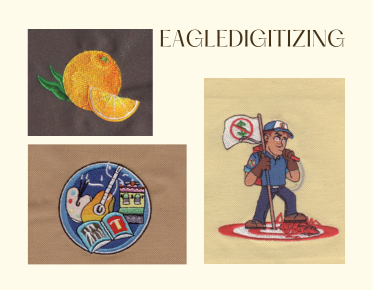
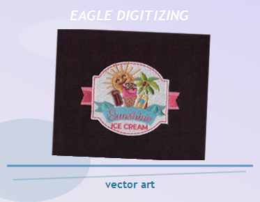
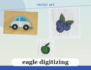
Simplifying embroidered patch artwork means removing extra detail while protecting the logo shapes, contrast, and color cues that make the brand recognizable in stitches. The best results start with clean embroidery digitizing, smart vector cleanup, and a patch design that respects thread limits. If you are preparing a file now, logo vectorization service support can help you clean the artwork before production, and you can Upload Your Design for a quick estimate.
Keep the Brand Marks That Customers Actually Remember
Do not strip away the parts people identify first: the wordmark, icon silhouette, or signature color balance. For embroidered patch artwork, those anchors matter more than tiny details that will blur, fill in, or disappear once stitching begins.
Start with Clean Vector Shapes, Not a Busy Raster File
Patch artwork works better when the file is rebuilt into sharp paths instead of being traced from a noisy image. A proper ai logo vectorization workflow makes the edges cleaner, reduces guesswork, and gives the digitizer a stronger base for stitch planning.
Remove Detail the Machine Cannot Reproduce Clearly
Fine textures, thin outlines, tiny shadows, and complex gradients often create more problems than value. Good simplification keeps the design recognizable at patch size while respecting embroidery limitations, especially small lettering limitations and narrow gaps that can close during sewing.
Match the Artwork to the Patch Size Before You Approve It
A design that looks polished on a screen may fail when reduced to three or four inches. At patch scale, spacing, letter height, and icon thickness must be checked early so the finished piece still reads clearly from a normal viewing distance.
Plan for Fabric Compatibility and Patch Construction
The same art may stitch differently on twill, felt, or specialty backing. Fabric compatibility affects how much detail the patch can safely hold, and border style also matters because the edge treatment can make a design look cleaner or more crowded.
Use Stitch Density to Support, Not Smother, the Design
Overdense areas can create stiffness and distortion, while light coverage can expose gaps and weaken the logo. The right stitch density helps the art stay readable and keeps the patch flexible enough for everyday apparel branding.
Control Thread Direction Before the Logo Starts to Lose Shape
Thread direction guides how light hits the patch and how each section of the design feels visually. When the stitch angles follow the artwork intelligently, the brand looks sharper, the contours feel smoother, and the patch gains a more polished finish.
Build in Underlay and Pull Compensation from the Beginning
Underlay stabilizes the surface, while pull compensation offsets the way stitches draw fabric inward. Those choices are not decorative extras; they are what keep circles round, letters stable, and borders from shrinking after the sew-out.
Turn a Complicated File into a Production-Ready Workflow
If the only artwork you have is a JPG or PNG, rebuild it before digitizing. A careful png to vector converter process can clean edges, simplify layers, and prepare a stronger file for embroidery production. That is often the difference between a smooth approval and repeated revisions.
Professional file prep also reduces hidden risk. Eagle Digitizing reviews whether the artwork can actually stitch, then adjusts the structure so the patch is easier to produce, easier to approve, and less likely to need a costly redo.
Know the Common Mistakes That Weaken the Brand
Most weak patch artwork fails for the same reasons: too many tiny elements, inconsistent line weight, low contrast, and no clear hierarchy. A strong patch design does not try to show everything; it shows the right things in a way embroidery can preserve.
Use Professional Redrawing When the Original File Is Not Enough
Sometimes a fast online trace looks convenient, but it leaves broken curves, rough corners, and awkward spacing that cause problems later. A dependable logo redraw service can rebuild the artwork with stitchability in mind, which is especially valuable when the brand identity has to stay consistent across multiple apparel items.
How to Protect Brand Identity Without Overdesigning the Patch
Focus on recognition, not decoration. If the icon, name, and color structure still communicate the brand instantly, the patch does its job. Simplification should make the logo stronger at production size, not flatter or less memorable.
When the File Is Right, Embroidery Production Moves Faster
Clean artwork shortens back-and-forth, reduces sew-out surprises, and helps the team test the design with fewer variables. If you need a quote, Get a Free Estimate once the core shapes are approved, because a production-ready file always gives more accurate pricing and better expectations.
FAQ
How much detail should be removed from embroidered patch artwork?
Remove anything that becomes unreadable at patch size, including tiny text, thin lines, and decorative effects. Keep the logo elements that people recognize first and simplify the rest for stitch clarity.
Do I need a vector file before digitizing a patch?
Yes, a vector file is the best starting point because it gives cleaner edges and easier editing. If you only have a raster image, convert or redraw it before embroidery digitizing begins.
Can small lettering still work on an embroidered patch?
Sometimes, but only if the letters are large enough to stitch cleanly. Small lettering often needs to be enlarged, simplified, or removed so the final patch stays legible.
When a patch has to protect the brand and still sew well, the safest approach is simple: clean the artwork, respect embroidery limits, and test the file before production starts. Eagle Digitizing can help you shape a design that looks strong on screen and stays consistent in thread, so if you are ready to move forward, Start Your Embroidery Project and send the file for review.