
A Practical Guide to Digitizing restaurant apron logos Without Losing Detail
Digitizing restaurant apron logos without losing detail means turning artwork into stitches that stay readable on real fabric. The best files protect key shapes, control stitch density, and use underlay and pull compensation so the logo still looks crisp after long kitchen use and frequent washing. For brands that need digitizing for restaurant uniforms, that balance matters from the first file.
Quote Now if you want your apron logo reviewed for stitch limits before production starts.
Start With Stitch-Friendly Artwork
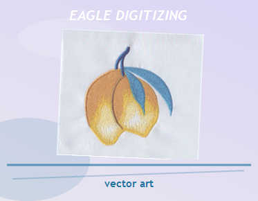
Low-resolution files, rough edges, and tiny decorative extras usually become the first casualties in embroidery. Clean vector art gives the digitizer a stable path, and embroidered logo cleanup before digitizing helps remove problems before they turn into broken outlines or uneven fills.
Preserve the Details Customers Actually Notice
Restaurant apron logos do not need every pixel from the original design. They need the name, icon, and brand shape that people recognize at a glance. If a small utensil line or tagline is too thin, simplify it so the finished stitch file stays readable and durable.
Use the Right Stitch Type for Each Area
Satin stitch works well for clean borders and letters, while running stitch can protect delicate accents and narrow lines. Fill stitches suit larger areas, but only when the shape can support the texture. Smart stitch selection keeps the logo from looking heavy or crowded on the apron.
Keep Stitch Density Balanced
Too much embroidery density can make apron fabric stiff, distort curves, and increase thread breaks. Too little density leaves open spots and weak color coverage. The right balance depends on logo size, thread direction, and the fabric’s ability to hold the design without puckering.
Match the Settings to the Apron Fabric
Cotton twill, canvas, denim, and polyester blends all behave differently under a needle. A stiff apron can handle more structure, while softer or lighter fabric may need lighter coverage. Fabric compatibility matters because the same logo can stitch well on one apron and fail on another.
Respect Seams, Pockets, and Placement
Aprons often have seams, top pockets, waist ties, and folds that affect the finished look. If the logo sits too close to a seam, the shape may bend or disappear in wear. Good placement planning protects edge control and keeps the artwork easy to read.
Use Underlay and Pull Compensation Correctly
Underlay supports the top stitches and gives the logo a stable base. Pull compensation helps account for fabric movement so circles stay round and letters do not collapse. These settings are especially important when the apron logo includes small type or narrow borders.
Think About Thread Direction Before You Stitch
Thread direction affects shine, texture, and the way light hits the design. It also changes how the embroidery behaves around curves and corners. When the stitch path follows the artwork instead of fighting it, the final logo looks sharper and more polished on the apron.
Prepare the Right File Formats for Production
Many customers send a PNG or JPG, but embroidery production needs a true stitch file. A good embroidery file conversion service can turn artwork into a usable production file, while a dst file digitizing service helps shops get the format they need for commercial machines.
Make the File Preparation Workflow Simple
Good file prep starts with the logo, then adds size, placement, garment type, and thread colors. That information helps the digitizer decide whether the design should be simplified, widened, or split into cleaner stitch sections. Upload Your Design early if you want fewer revisions later.
Sew-Out Testing Catches Problems Before Bulk Production
A sew-out test shows what the screen cannot. It reveals if text fills in, borders distort, or a satin column is too wide for the fabric. Testing a sample before a full restaurant run saves time, reduces waste, and protects the brand from avoidable surprises.
Know When Small Lettering Needs to Be Simplified
Small lettering is one of the hardest parts of apron logo embroidery. If the text is too tiny, the stitches can merge and become unreadable. In many cases, a cleaner shortened version works better than trying to force details that the machine cannot hold.
Avoid the Mistakes That Lead to Rework
The most common issues are weak artwork, crowded details, oversized stitch counts, and ignoring how the apron moves on the body. Another problem is asking embroidery to copy print art exactly. Stitch-based production needs editing, not blind tracing, if you want reliable results.
Why Restaurant Aprons Need Durable Embroidery
Aprons face heat, stains, movement, and repeated laundering, so the logo has to stay stable over time. Durable embroidery depends on controlled density, smart stitch direction, and clean edge handling. That is why detail should be protected, but never at the expense of wearability.
How Eagle Digitizing Supports Apron Logo Production
Eagle Digitizing helps turn artwork into embroidery-ready files that are easier to run on real machines. The value is not just in making a logo look good on screen. It is in preparing the file so the stitching, spacing, and fabric behavior work together.
When to Ask for Help Before the Order Starts
If the logo has fine lines, small type, or a complex layout, it is better to review the art before production begins. That is the moment to decide what should stay, what should be simplified, and what file adjustments will protect the final apron order from avoidable issues.
FAQ
What is the biggest risk when digitizing restaurant apron logos?
The biggest risk is losing readability in small text, thin lines, or crowded details. Clean digitizing, proper density, and fabric-aware settings help the logo stay sharp on real aprons.
Do I need vector art before embroidery digitizing?
Vector art is strongly preferred because it gives cleaner edges and easier cleanup. If you only have a raster file, it should be cleaned up before digitizing to avoid jagged stitches.
What should I send when requesting a quote?
Send the logo file, final size, apron type, placement notes, and any thread color preferences. That gives the digitizer enough information to prepare the file correctly and estimate the project accurately.
When your apron logo needs to look clean in the dining room and hold up in the kitchen, the file work matters as much as the thread. Eagle Digitizing can help you prepare the artwork, reduce production risk, and move forward with more confidence, so Contact Us or Upload Your Design when you are ready to start.